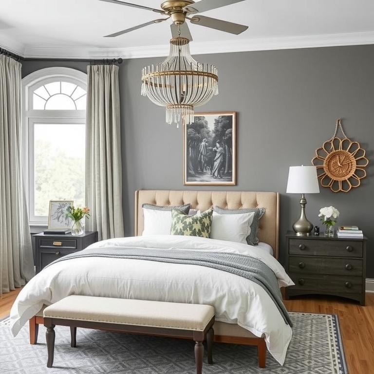
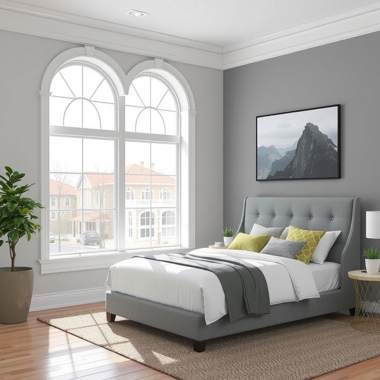
Choosing the right paint color for your bedroom can feel overwhelming, but it doesn’t have to be! Gray is a versatile and popular choice, offering a calming and sophisticated atmosphere. Sherwin-Williams offers a wide range of stunning grays, each with its unique undertones and character.
This comprehensive guide explores 12 of the best Sherwin-Williams gray paints perfect for bedrooms, considering factors like light exposure, desired mood, and overall style. We’ll delve into each shade’s nuances, providing practical advice to help you make the perfect selection.
Get ready to discover your dream bedroom color and create a space that promotes relaxation and rejuvenation. Let’s dive into the world of Sherwin-Williams grays!
-
Agreeable Gray SW 7029

Agreeable Gray SW 7029 Agreeable Gray is a timeless classic, beloved for its versatility and subtle warmth. It’s a greige, meaning it blends gray and beige tones beautifully, creating a calming and inviting atmosphere.
This versatile shade works well in various lighting conditions, adapting to both sunny and dimly lit rooms. Its subtle warmth makes it a great choice for bedrooms, promoting a sense of comfort and relaxation.
Consider Agreeable Gray for a classic, timeless feel. Pair it with warm wood tones for a cozy aesthetic or crisp white trim for a cleaner look.
-
Repose Gray SW 7015
Repose Gray SW 7015 Repose Gray is a popular choice for its calming and sophisticated feel. This slightly cooler gray works wonders in bedrooms, creating a serene and tranquil atmosphere.
Its versatility allows it to adapt to different styles, from modern minimalist to traditional. It works equally well in rooms with ample natural light or those that are more dimly lit.
To enhance Repose Gray, try adding pops of color through textiles and accessories. Warm metallic accents or natural textures can add depth and warmth.
-
Silver Marlin SW 7608
Silver Marlin SW 7608 Sherwin-Williams Silver Marlin (SW 7608) offers a serene and sophisticated backdrop for bedrooms. Its slightly cool undertones prevent it from feeling too stark, making it suitable for various styles. Consider pairing it with white trim for a classic look or warmer wood tones for a more cozy ambiance.
Silver Marlin’s versatility allows for diverse design approaches. For a calming effect, use it on all four walls and incorporate soft, textural elements like linen bedding and sheepskin rugs. A bolder approach might include a contrasting accent wall in a deeper gray or a complementary blue.
To lighten the feel of Silver Marlin, consider using it on the walls and ceiling for a more airy, spacious effect. You can also introduce warmth through lighting; soft, warm-toned bulbs will offset the cool undertones of the paint beautifully. Subtle variations in furniture choices can significantly impact the overall look.
Experiment with different sheens. An eggshell finish provides a soft, subtle look with good durability, while a satin finish offers increased washability and sheen for high-traffic areas. Remember to always test paint samples in your bedroom under various lighting conditions before committing to a full paint job.
-
Mindful Gray SW 9171
Mindful Gray SW 9171 Mindful Gray (SW 9171) offers a serene and versatile backdrop for bedrooms. Its calm, slightly cool undertones create a relaxing atmosphere without feeling stark. Consider pairing it with warm white trim for a touch of contrast and brightness.
For a warmer feel, incorporate natural wood tones in your furniture and accessories. This will balance Mindful Gray’s cool undertones and add textural depth to the room. Soft, textured fabrics like linen or cotton in creamy whites or warm neutrals further enhance this warmth.
To achieve a more modern look, use metallic accents like brushed nickel or brass. These add a touch of sophistication without overwhelming the calming palette of Mindful Gray. Experiment with different shades of gray in accessories for subtle variation.
If you prefer a lighter feel, consider using Mindful Gray on the walls and a lighter, almost white shade on the ceiling. This creates a sense of airiness and heightens the feeling of spaciousness. Think about adding pops of color through artwork or textiles for a personalized touch.
-
Classic Gray SW 7018
Classic Gray SW 7018 Classic Gray (SW 7018) is a versatile, warm gray that works beautifully in bedrooms. Its subtle undertones prevent it from feeling too stark or cold, making it ideal for creating a calming and inviting atmosphere. Consider pairing it with white trim for a crisp, clean look, or warmer wood tones for a more cozy feel. It complements a range of furniture styles.
For a slightly lighter feel, consider using Classic Gray on the walls and a brighter white on the ceiling and trim. This will help to maximize natural light and make the room feel more spacious. Adding pops of color through bedding or artwork can personalize the space without overpowering the calming gray backdrop. Experiment with different textures, like linen bedding or a woven rug, to add visual interest.
If you prefer a deeper shade, consider using Classic Gray in a slightly darker room with less natural light. This rich, muted tone can add depth and sophistication. Use it in combination with metallic accents, such as brushed nickel or gold, to amplify its elegance. Consider a darker gray for the ceiling to add to the depth and coziness of the space.
Remember to test paint colors in your own bedroom before committing to a full paint job. Lighting conditions vary greatly depending on the time of day and the orientation of your room, which can affect how the color looks. This will help you determine if Classic Gray is the perfect match for your space and personal preference. Small sample swatches can save you from committing to an entire room of a color that you end up not liking.
-
Naval SW 6244
Naval SW 6244 Naval SW 6244 is a popular choice for bedrooms, offering a sophisticated and calming dark gray hue. Its deep tone creates a cozy atmosphere, perfect for relaxation. Consider pairing it with white trim and warm metallic accents for a touch of elegance.
For a slightly lighter feel, explore the variations offered by Sherwin-Williams. A lighter gray like Agreeable Gray SW 7029 offers a similar calming effect without the same darkness. This works well in rooms with less natural light.
To add warmth to Naval, incorporate natural wood elements and soft textiles. Think woven baskets, wooden nightstands, and cozy bedding in warm neutrals or muted jewel tones. This balances the coolness of the gray and creates a well-rounded space.
Remember to test paint samples in your bedroom under various lighting conditions before committing. Lighting significantly impacts how a color appears, so ensuring you love the look throughout the day is crucial. This will prevent any regrets later on.
-
Gauntlet Gray SW 7019
Gauntlet Gray SW 7019 Sherwin-Williams Gauntlet Gray (SW 7019) offers a sophisticated, versatile gray perfect for bedrooms. Its slightly warm undertones prevent it from feeling too stark or cold. Consider pairing it with white trim for a classic, clean look, or incorporate warmer wood tones for a cozy atmosphere.
Gauntlet Gray works beautifully in various lighting conditions. In rooms with ample natural light, it maintains a calming presence. In rooms with less natural light, it still feels airy and inviting, avoiding a cave-like feel. Experiment with different levels of sheen; eggshell provides a soft finish, while satin offers more durability.
For a subtle variation, explore Sherwin-Williams Agreeable Gray (SW 7029). It’s a lighter, more versatile gray that provides a similar calming effect. Alternatively, for a deeper tone, consider SW 7015, which provides more drama but maintains the sophisticated feel of Gauntlet Gray. Choosing the right undertones depends on your personal preferences and the existing light in your bedroom.
Remember to test paint samples on your walls before committing to a full paint job. Lighting conditions significantly impact the final appearance of the color. Painting a large section, rather than a small swatch, helps to ensure accuracy and gives you a clearer understanding of the color’s impact in your bedroom.
-
Iron Ore SW 7070
Iron Ore SW 7070 Iron Ore SW 7070 is a popular choice for bedrooms due to its dramatic, sophisticated feel. Its deep gray hue creates a cozy and calming atmosphere, perfect for restful sleep. Consider pairing it with warm wood tones or metallic accents for added richness.
For a slightly lighter look, consider using Iron Ore on the walls and a lighter gray, such as Agreeable Gray, on the trim. This creates a subtle contrast that adds visual interest without being overwhelming. Alternatively, use a lighter gray on the ceiling to prevent the room from feeling too dark.
Accessorizing is key with Iron Ore. Incorporate textures like soft linens and plush rugs to add warmth and comfort. Metallic accents, such as brushed nickel or gold hardware, complement the deep gray beautifully.
Remember to test paint samples in your bedroom under various lighting conditions. Natural light can significantly impact how a color appears, so viewing it at different times of day is crucial before committing to a full paint job. Consider the north, south, east and west light exposure of your bedroom in your final color decision.
-
Sherwin Williams Anonymous SW 7021
Sherwin Williams Anonymous SW 7021 Anonymous is a popular and versatile neutral that works well in a variety of settings, including bedrooms. Its slightly cool tone makes it an excellent choice for a modern aesthetic.
Its versatility makes it perfect for those who want a neutral background for expressing their individuality through accessories. It’s a good choice for rooms with limited natural light.
Experiment with textures and patterns to add visual interest to a space painted in Anonymous, as its neutral tone provides the perfect blank canvas.
-
Seapearl SW 6171
Seapearl SW 6171 Seapearl (SW 6171) is a popular Sherwin-Williams gray for bedrooms due to its versatility and soft, calming nature. It leans slightly cool, making it suitable for rooms with various lighting conditions. Consider pairing it with white trim for a classic look or warmer wood tones for a more rustic feel.
Seapearl works well in both small and large bedrooms. In smaller spaces, it can make the room feel airy and open. Larger bedrooms benefit from its calming effect, creating a soothing and restful atmosphere. Its subtle gray hue avoids feeling stark or sterile.
For a slightly warmer variation, consider using Sherwin-Williams Agreeable Gray (SW 7029) as an alternative. It’s a popular choice and offers a similar calming effect but with warmer undertones. Experiment with different lighting to see how each color appears throughout the day.
To add personality, incorporate pops of color in bedding, artwork, or accessories. Consider adding warm metallic accents like brass or gold for a touch of elegance. These subtle additions personalize the space without overwhelming the calming effect of the Seapearl gray.
-
Gray Matters SW 7659
Gray Matters SW 7659 Sherwin-Williams’ Gray Matters (SW 7659) offers a versatile, slightly warm gray perfect for bedrooms. Its subtle undertones prevent it from feeling too cool or stark. Consider pairing it with white trim for a crisp, clean look, or warmer wood tones for a cozier feel.
For a dramatic effect, use Gray Matters on an accent wall, contrasting it with a lighter gray or creamy white on the remaining walls. This technique adds visual interest without overwhelming the space. Adding pops of color through bedding or artwork will further personalize the room.
To lighten the mood, consider using Gray Matters on the ceiling as well as the walls for a calming, enveloping effect. Alternatively, a lighter shade of gray or off-white on the ceiling creates a sense of height and airiness. Remember to always test paint samples in your space under various lighting conditions.
Gray Matters’ adaptability makes it suitable for various bedroom styles, from modern minimalist to traditional. Experiment with different textures and materials – like linen bedding or a natural fiber rug – to complement the paint color and create your desired atmosphere. The subtle warmth of Gray Matters provides a relaxing and sophisticated backdrop for your personal style.
-
Modern Gray SW 7632
Modern Gray SW 7632 Sherwin-Williams Modern Gray (SW 7632) offers a sophisticated, versatile gray for bedrooms. Its slightly cool undertones prevent it from feeling too stark or sterile. Consider pairing it with warm white trim for a balanced, calming effect. This creates a sophisticated yet relaxing atmosphere perfect for sleep.
For a warmer feel, consider using Modern Gray with warmer wood tones or metallic accents like brushed gold or bronze. These additions create visual interest and depth without overpowering the soft gray base. The subtle coolness of the gray allows these warmer elements to shine.
To lighten the space, incorporate plenty of natural light and reflective surfaces. Mirrors or glossy furniture can amplify the light, preventing the room from feeling gloomy. Consider lighter shades of Modern Gray on the ceiling or smaller accent walls for a brighter, airy feel.
Alternatively, deepen the Modern Gray effect by using it on both the walls and ceiling for a more dramatic, cocooning ambiance. Use darker gray or black accents for a truly modern look, balancing the deep shade with strategically placed light fixtures. Experiment with different textures for depth and visual interest.


Editor’s Recommendations
- Test paint samples in your bedroom before committing to a full paint job.
- Consider the natural light in your bedroom when selecting a gray shade.
- Don't hesitate to experiment with different combinations of grays and complementary colors.
Conclusion
Choosing the perfect Sherwin-Williams gray paint for your bedroom is a journey of personal style and preference. We hope this guide has helped you narrow down your choices and discover the ideal shade for your space.
Remember to always test your chosen paint color on a larger area of your wall to see how it looks in different lighting conditions throughout the day. This step will prevent unexpected surprises and ensure you’re completely satisfied with your final choice.
Embrace the transformation and enjoy your newly painted, relaxing bedroom sanctuary!