Blooming Walls: 12 Must-Try Wall Painting Ideas for Spring That Everyone Loves
Spring is in the air! The days are getting longer, the flowers are starting to bloom, and there’s an undeniable sense of renewal all around. It’s the perfect time to shake off the winter blues and breathe new life into your home. And what better way to do that than1 with a fresh coat of paint? Wall painting is one of the easiest and most impactful ways to transform a space, and this spring, the possibilities are more exciting than ever.
Forget drab and dreary; this season is all about embracing colors and patterns that evoke joy, tranquility, and the vibrant energy of nature. Whether you’re looking for a subtle refresh or a bold statement, we’ve curated 12 must-try wall painting ideas for spring that are sure to be loved by everyone who steps into your home. These ideas are designed to be inspiring, achievable, and perfectly timed for a seasonal home makeover. Get ready to roll up your sleeves and let your walls blossom!
1. Pastel Paradise: The Enduring Charm of Soft Hues
Pastels are a perennial spring favorite, and for good reason. Soft, airy, and endlessly calming, colors like mint green, blush pink, baby blue, lavender, and pale yellow instantly create a serene and uplifting atmosphere. This spring, pastels are back with a sophisticated twist.
Why it’s perfect for Spring: Pastels mirror the delicate new blooms and soft light of the season. They make rooms feel larger, brighter, and more open – a perfect antidote to the cooped-up feeling of winter.
How to execute it:
- Full Room Serenity: Paint an entire room in a single pastel shade for a truly immersive and tranquil experience. Consider a soft lavender for a calming bedroom or a pale mint green for a refreshing bathroom.
- Subtle Accent Walls: If a full pastel room feels too much, opt for a single pastel accent wall. This works beautifully in living rooms behind a sofa or in a nursery.
- Two-Tone Elegance: Combine two complementary pastels for a sophisticated look. Think a pale pink upper wall with a slightly deeper dusty rose below, separated by a crisp white chair rail.
- Color Palette Suggestions:
- Modern & Fresh: Mint green paired with soft gray and white accents.
- Warm & Inviting: Blush pink with creamy whites and touches of gold.
- Calm & Coastal: Baby blue with sandy beige and natural wood tones.
- Whimsical & Sweet: Pale yellow combined with soft lilacs and light wood.
Why everyone loves it: Pastels are universally appealing because they are gentle on the eyes and create a peaceful environment. They are versatile enough to suit various decor styles, from modern minimalist to shabby chic and Scandinavian. A pastel palette brings a touch of optimistic elegance that’s hard to resist.
2. Verdant Vistas: Bringing the Outdoors In with Green
As nature reawakens, so does our desire to connect with it. Green, in all its myriad shades, is the quintessential color of spring growth, renewal, and vitality. From muted sages to lively limes, incorporating green into your walls can make your home feel like a natural sanctuary.
Why it’s perfect for Spring: Green directly reflects the lush foliage and new life emerging outdoors. It’s known for its calming and stress-reducing properties, making it ideal for creating a restorative home environment.
How to execute it:
- Earthy Sage: A muted, earthy sage green is incredibly versatile and sophisticated. It works well in living rooms, kitchens, and bedrooms, creating a calming, organic feel.
- Refreshing Mint: A lighter, brighter mint green (as mentioned in pastels) can make spaces feel airy and clean – perfect for bathrooms or a home office.
- Deep Forest Green Accent: For a touch of drama and depth, consider a rich forest green or emerald green accent wall. This can look stunning in a dining room or behind a headboard.
- Botanical-Inspired Patterns: Use stencils or freehand paint subtle leaf patterns or trailing vines in varying shades of green over a neutral base.
- Color Palette Suggestions:
- Natural Harmony: Sage green with beige, cream, and light wood.
- Vibrant Energy: Lime green accents paired with bright white and touches of yellow.
- Sophisticated Depth: Forest green with gold or brass accents and dark wood.
Why everyone loves it: Green is inherently linked to nature, promoting feelings of well-being and tranquility. Its vast range of shades means there’s a green for every taste and style, from the subtle to the statement-making. It connects us to the outdoors, which is particularly craved during the spring season.
3. Sunny Disposition: Embracing Cheerful Yellows
Nothing says spring quite like the warmth and optimism of sunshine. Yellow, in its softer and more sophisticated tones, can instantly brighten a room and lift spirits. This isn’t about overwhelming, electric yellows, but rather buttery, primrose, or citrus-infused hues.
Why it’s perfect for Spring: Yellow embodies the increasing sunlight and cheerful energy of the season. It’s associated with happiness, optimism, and creativity.
How to execute it:
- Soft Buttery Walls: A pale, buttery yellow can create a warm and welcoming glow in kitchens, breakfast nooks, or children’s rooms.
- Primrose Accent: A gentle primrose yellow accent wall can add a touch of spring cheer to a living room or hallway without being overpowering.
- Lemon Zest Details: Use a brighter, citrusy yellow for smaller details, like the inside of a bookshelf, a door, or as part of a painted pattern.
- Color Washing Technique: Apply a thin wash of pale yellow over a white or cream base for a subtle, sun-kissed effect.
- Color Palette Suggestions:
- Classic Cheer: Buttery yellow with crisp white trim and light blue accents.
- Modern Sunshine: Muted ochre or mustard yellow (for a more sophisticated take) with grays and blacks.
- Playful Pop: Primrose yellow with mint green and white.
Why everyone loves it: Yellow is an inherently happy color. Well-chosen shades can make a space feel more inviting, energetic, and full of light – feelings everyone appreciates, especially as winter recedes.
4. Watercolor Wonders: Soft, Blended Effects
Inspired by the delicate beauty of spring blossoms and soft rain showers, the watercolor effect on walls is a dreamy and artistic way to refresh your space. This technique involves blending colors softly to mimic the translucent and flowing nature of watercolor paintings.
Why it’s perfect for Spring: The soft, ethereal look of watercolor perfectly captures the gentle and artistic side of spring. It’s unique, calming, and can be customized with your favorite spring hues.
How to execute it:
- Ombre Effect: Create a gradient effect where one color (or multiple colors) softly transitions into another or into white. Think a sky blue fading into a soft white, or a blend of pastel pink and lavender.
- Abstract Washes: Apply diluted paint in irregular, overlapping patches, allowing colors to bleed into each other slightly. This works best with analogous colors (colors next to each other on the color wheel).
- Tools: Use sponges, soft rags, or wide, soft brushes. You’ll be working with watered-down latex paint or specialized glazing liquids mixed with paint.
- Color Palette Suggestions:
- Spring Sky: Blends of soft blues, pale grays, and hints of lavender.
- Floral Dream: Washes of blush pink, peach, and soft yellow.
- Misty Morning: Combinations of muted greens, blues, and grays.
Why everyone loves it: The watercolor effect is unique and adds a touch of handmade artistry to a room. It’s visually soft and calming, creating a serene escape. It’s a departure from solid-colored walls and offers a sophisticated, personalized touch.
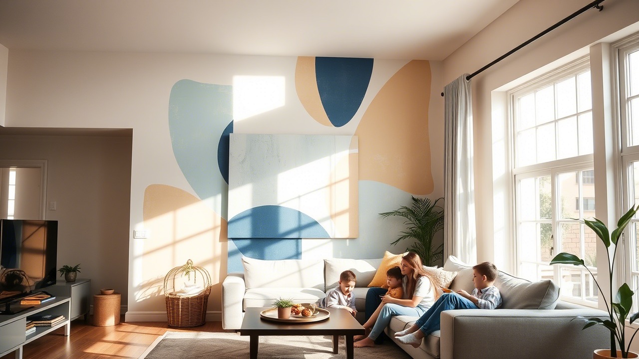
5. Subtle Stripes & Gentle Geometrics: Modern Lines for a Fresh Start
While bold patterns can be fun, spring often calls for something a little lighter and more refined. Subtle stripes or gentle geometric patterns can add interest and structure to a room without overwhelming it. Think low-contrast color combinations and delicate lines.
Why it’s perfect for Spring: These patterns offer a sense of order and cleanliness, aligning with the “spring cleaning” mentality. They can also subtly elongate or widen a room, making it feel more spacious.
How to execute it:
- Tone-on-Tone Stripes: Use the same color in two different sheens (e.g., matte base with satin stripes) or two very similar shades for a sophisticated, barely-there striped effect. Vertical stripes can make ceilings feel higher, while horizontal stripes can make a room feel wider.
- Delicate Geometric Accents: Create a feature wall with a simple, large-scale geometric pattern using painter’s tape. Think overlapping triangles or a subtle honeycomb pattern in soft, complementary colors.
- Low-Contrast Color Blocking: Divide a wall into two or three sections with colors that are close in value, creating a modern and calming effect.
- Color Palette Suggestions:
- Minimalist Chic: Soft gray with a slightly lighter or darker gray for stripes.
- Coastal Calm: Pale blue and white thin stripes.
- Warm Neutrals: Cream and beige in a subtle geometric pattern.
Why everyone loves it: Subtle patterns add a layer of sophistication and visual interest without being jarring. They are modern yet timeless and can adapt to various decor styles. The understated elegance is often preferred for a calming spring refresh.
6. Floral Accents & Botanical Motifs: A Nod to Nature’s Artistry
What’s spring without flowers? Bringing floral and botanical elements onto your walls is a direct celebration of the season. This doesn’t have to mean busy, old-fashioned wallpaper; think modern, stylized painted motifs.
Why it’s perfect for Spring: This idea directly mirrors the blooming outdoors, infusing your space with life, color, and the delicate beauty of nature.
How to execute it:
- Single Statement Bloom: Paint a large, stylized flower or a branch with blossoms as a focal point on an accent wall. This can be quite artistic and impactful.
- Subtle Stenciled Patterns: Use stencils to create repeating patterns of leaves, ferns, or small floral designs. Opt for delicate lines and soft colors.
- Hand-Painted Vines or Branches: If you’re artistic, freehand paint delicate vines trailing around a doorway, along the top of a wall, or in a corner.
- Negative Space Florals: Paint a wall a solid color, then use painter’s tape to create the outline of a floral pattern and paint over it with a contrasting color. When you remove the tape, the original wall color forms the floral design.
- Color Palette Suggestions:
- Delicate & Romantic: Soft pinks, peaches, and greens for florals on a cream background.
- Modern Botanical: Shades of green for leaves and ferns on a crisp white or light gray wall.
- Bold & Artistic: A vibrant floral mural incorporating bolder spring colors.
Why everyone loves it: Floral and botanical elements are inherently beautiful and uplifting. They add a touch of organic charm and can make a space feel more alive and connected to the natural world, which is particularly welcome in spring.
7. The Sky’s the Limit: Ceiling Paint Ideas
Often referred to as the “fifth wall,” the ceiling is a frequently overlooked canvas. Painting your ceiling can be a surprisingly effective way to refresh a room for spring and create a unique impact.
Why it’s perfect for Spring: Looking up at a beautifully painted ceiling can evoke the feeling of an open sky or a blooming canopy, adding an element of surprise and spaciousness.
How to execute it:
- Soft Sky Blue: Painting a ceiling a very pale, soft blue can create an illusion of height and an airy, open feel, reminiscent of a clear spring sky.
- Subtle Tint of Wall Color: Choose a color that is a few shades lighter than your wall color for a cohesive and subtly elevating effect.
- High Gloss for Light Reflection: A high-gloss white or very pale pastel on the ceiling can reflect more light into the room, making it feel brighter and more expansive. This works well in rooms with ample natural light.
- Unexpected Pop of Color: For a bolder statement in a playroom or a creative space, consider a cheerful pastel or a soft spring color on the ceiling, keeping the walls neutral.
- Painted “Canopy” Effect: In a bedroom, paint the ceiling a slightly deeper shade than the walls or add a subtle painted border to create a cozy, canopy-like feeling.
Why everyone loves it: Paying attention to the ceiling is unexpected and adds a designer touch. It can make a room feel more complete, thoughtful, and can subtly influence the perception of space and light, contributing to a fresh spring atmosphere.
8. Earthy Terracotta & Warm Neutrals: Grounded Spring Vibes
While pastels and brights are spring staples, don’t overlook the grounding power of earthy tones. Warm terracottas, soft clays, and rich beiges can create a comforting and sophisticated backdrop that still feels fresh for the season, especially when paired with lighter accents.
Why it’s perfect for Spring: These colors connect us to the earth awakening in spring. They provide warmth and stability, creating a nurturing environment that feels both cozy and renewed.
How to execute it:
- Terracotta Accent Wall: A feature wall in a warm, muted terracotta can add incredible warmth and a touch of rustic charm to a living room or dining area.
- Soft Clay All Over: A lighter clay or beige tone can create a sophisticated and calming atmosphere in a bedroom or study.
- Pair with Natural Textures: These colors look stunning with natural wood, rattan, linen, and, of course, plenty of green plants.
- Color Palette Suggestions:
- Desert Bloom: Muted terracotta with cream, sage green, and touches of dusty rose.
- Warm Minimalism: Soft beige or clay with white and black accents for a modern look.
- Earthy Comfort: Rich mushroom or greige tones with layers of natural textures.
Why everyone loves it: Earthy tones are inherently comforting and create a sense of connection to the natural world. They are sophisticated, timeless, and provide a warm, inviting alternative to cooler spring palettes.
9. Color Drenching: Monochromatic Immersion
Color drenching, or painting walls, trim, doors, and sometimes even the ceiling in the same shade (or very similar shades), is a contemporary trend that can be beautifully adapted for spring. It creates a cohesive, immersive, and surprisingly calming effect.
Why it’s perfect for Spring: Using a single, fresh spring color throughout a space can make it feel expansive and serene. It simplifies the visual landscape, allowing architectural details and furnishings to stand out in a new way.
How to execute it:
- Choose Your Spring Hue: This technique works well with soft spring pastels (like a dusty blue or a sage green) or sophisticated mid-tones.
- Vary Sheens (Optional): For subtle dimension, you can use different paint sheens for different surfaces – e.g., matte or eggshell for walls, satin or semi-gloss for trim and doors, all in the same color.
- Small Rooms Benefit: Color drenching can make smaller rooms feel larger and less cluttered by blurring the lines between surfaces.
- Color Palette Suggestions:
- Serene Green Cocoon: A soft sage green on walls, trim, and ceiling.
- Airy Blue Escape: A pale sky blue enveloping the entire room.
- Sophisticated Peach Nook: A muted peach or apricot tone for a warm, unified look.
Why everyone loves it: Color drenching is a bold yet sophisticated move that creates a strong sense of atmosphere and intentionality. It’s modern, enveloping, and can make a space feel incredibly calming and cohesive – a perfect refresh for the new season.
10. Chalk Paint Accents: Rustic Charm for Spring Details
Chalk paint isn’t just for furniture! Its ultra-matte finish and unique texture can be used to create charming accent walls or decorative details that evoke a rustic, farmhouse-inspired spring feel.
Why it’s perfect for Spring: The soft, matte finish of chalk paint complements the gentle light of spring. It can be used to create features that feel handcrafted and inviting, aligning with the season’s emphasis on natural and authentic elements.
How to execute it:
- Matte Accent Wall: Paint a single wall in a soft spring color using chalk paint. Its velvety finish offers a different tactile and visual experience than standard latex paint.
- Distressed Details: Use chalk paint to create a feature like a faux shiplap wall (painting over wooden planks) and then lightly distress the edges for a vintage spring farmhouse look.
- Stenciled Patterns: Chalk paint works beautifully with stencils to create rustic patterns or lettering on a wall.
- Color Palette Suggestions:
- Farmhouse Fresh: Antique white or pale gray chalk paint.
- Soft & Vintage: Dusty rose or duck egg blue chalk paint.
- Pair with Natural Wood: Chalk paint finishes look particularly good alongside natural or reclaimed wood.
Why everyone loves it: Chalk paint offers a unique, velvety matte finish that’s different from standard wall paints. It evokes a sense of rustic charm and handcrafted appeal, which can make a space feel cozy, inviting, and full of character – perfect for a comforting spring vibe.
11. Ombre Wall Magic: Gradual Color Transitions
The ombre effect, where color gradually transitions from light to dark or from one hue to another, remains a captivating way to add artistic flair to your walls. For spring, think soft, airy transitions that mimic a sunrise or a field of flowers.
Why it’s perfect for Spring: Ombre walls can evoke the gentle shifts in light and color seen in nature during spring. It’s a visually dynamic yet soothing technique that can make a room feel unique and serene.
How to execute it:
- Choose Your Colors: Select two or three colors that blend well. For spring, consider a light pastel fading into white, or two analogous pastels (e.g., soft pink to lavender).
- Technique:
- Paint the lightest color over the entire wall or the top section.
- Paint the darkest color on the bottom section.
- While the paints are still wet, use a clean, dry brush (or multiple brushes) or a sponge to blend the colors where they meet, working in soft, sweeping motions. This takes patience and a bit of practice.
- Direction: You can create a vertical ombre (e.g., from side to side) or the more common horizontal ombre (top to bottom).
- Color Palette Suggestions:
- Spring Sunrise: Soft yellow at the bottom, fading to pale peach, then to creamy white at the top.
- Ocean Mist: Teal or aqua at the bottom, fading through pale blue to white.
- Floral Haze: Lavender at the bottom, blending into a soft pink.
Why everyone loves it: The ombre effect is visually stunning and adds a significant artistic touch to a room. It’s a great way to introduce multiple colors without them feeling disjointed. The soft, gradual transition is inherently calming and can make a space feel more dynamic and bespoke.
12. Interactive Chalkboard or Whiteboard Paint Sections: Functional Fun for Spring
Spring often brings a desire for organization and fresh starts. Incorporating a section of chalkboard paint or whiteboard paint can be a fun and functional addition, especially in kitchens, home offices, or kids’ rooms.
Why it’s perfect for Spring: It encourages creativity, list-making, and communication – all things that feel energizing for the new season. It’s a practical way to refresh a space with an interactive element.
How to execute it:
- Kitchen Command Center: Paint a section of a kitchen wall with chalkboard paint for grocery lists, meal plans, or family messages.
- Kids’ Creative Corner: Designate a lower section of a playroom wall with chalkboard or whiteboard paint for endless drawing and learning.
- Home Office Brainstorming Space: Use whiteboard paint on a wall for to-do lists, mind maps, and quick notes.
- Framed Sections: If you don’t want to dedicate a whole wall, paint a large framed piece of MDF or a smooth board with chalkboard/whiteboard paint and hang it.
- Color Options: Chalkboard paint is available in classic black, green, and even tintable versions. Whiteboard paint creates a clear, writable-erasable surface or can be white.
Why everyone loves it: These interactive surfaces are both fun and incredibly practical. They provide a dedicated space for creativity, organization, and communication, reducing clutter elsewhere. It’s a modern, engaging way to make your walls work for you, which is always appreciated.
Frequently Asked Questions
Q1: What are the most popular paint colors for spring 2025?
A1: For Spring 2025, we’re seeing a continued love for nature-inspired greens (sage, mint, olive), soft and airy pastels (blush pink, lavender, baby blue), cheerful yet sophisticated yellows (buttery, primrose), and grounding earthy tones (terracotta, warm clays). There’s also a move towards optimistic and calming blues.
Q2: How can I choose the right spring paint color for a small room?
A2: Lighter colors are generally recommended for small rooms as they make the space feel larger and brighter. Consider soft pastels, light neutrals, or pale yellows and blues. Painting the ceiling a lighter shade than the walls, or even a soft white, can also enhance the sense of space. Good lighting is also key.
Q3: What’s the easiest wall painting idea for a beginner to try this spring?
A3: Creating a simple accent wall with a fresh spring color is one of the easiest and most impactful ideas for beginners. Using a high-quality paint in a solid color like a soft sage green or a cheerful buttery yellow on one wall can instantly refresh a room without requiring complex techniques.
Q4: How do I prepare my walls for a spring painting project?
A4: Proper preparation is key! Clean the walls thoroughly with a mild detergent solution to remove dust and grime. Fill any nail holes or cracks with spackling compound and sand smooth once dry. Lightly sand glossy surfaces to help the new paint adhere. Use painter’s tape for crisp edges around trim, windows, and ceilings. Finally, apply a good quality primer if you’re making a drastic color change or painting over stains.
Q5: Can I incorporate more than one of these spring painting ideas in the same room?
A5: Absolutely! For instance, you could have three walls in a soft pastel (Idea #1) and one accent wall with subtle tone-on-tone stripes (Idea #5). Or, you could paint your walls a lovely sage green (Idea #2) and add a small, stenciled floral motif (Idea #6) above a doorway. The key is to ensure the chosen ideas and colors complement each other and don’t overwhelm the space.
Q6: How can I test paint colors before committing to painting an entire wall?
A6: Always test your paint colors! Purchase sample pots and paint large swatches (at least 1ft x 1ft) on different parts of the wall(s) you intend to paint. Observe the colors at different times of the day and under various lighting conditions (natural and artificial) to see how they truly look in your space.
Q7: Are there any eco-friendly paint options for my spring refresh?
A7: Yes, many brands now offer low-VOC (Volatile Organic Compounds) or zero-VOC paints. These paints release fewer harmful chemicals into the air, making them2 a healthier choice for your home and the environment. Look for labels indicating low or zero VOC content.
Q8: How long should I wait for the paint to dry between coats?
A8: Drying times vary depending on the type of paint (latex, oil-based), humidity, and temperature. Generally, latex paints are dry to the touch in about 1-2 hours and can be recoated in 2-4 hours. Always check the specific instructions on your paint can for the manufacturer’s recommendations.
Q9: What kind of paint finish is best for high-traffic areas or kids’ rooms?
A9: For high-traffic areas, hallways, and kids’ rooms, more durable and washable finishes like eggshell, satin, or even semi-gloss are recommended. These finishes can withstand more cleaning and are more resistant to scuffs and stains than flat or matte finishes.
Q10: How can I make my spring painted walls feel even fresher and more inviting?
A10: Complement your freshly painted walls with other spring touches! Open windows to let in fresh air, add new throw pillows or a light blanket in coordinating colors, bring in fresh flowers or green plants, and update your decor with lighter, brighter accessories. A clean and decluttered space will also enhance the impact of your new paint.
Conclusion – Let Your Walls Reflect the Season’s Joy
Spring is a time of transformation, and your home deserves to be part of that beautiful change. These 12 wall painting ideas offer a diverse range of styles, from the serenely subtle to the creatively bold, ensuring there’s something to inspire everyone. Whether you choose to embrace the gentle hues of a pastel paradise, the invigorating energy of sunny yellows, or the artistic flair of a watercolor wash, a fresh coat of paint is a powerful tool to rejuvenate your living spaces.
Don’t be afraid to experiment, to play with color, and to let your personality shine through. The most important thing is to create a home that feels joyful, refreshing, and truly reflective of the vibrant spirit of spring. So, pick up those brushes, choose your favorite idea, and get ready to watch your walls – and your mood – blossom!
Leave a Reply