10 Genius Wall Painting Solutions to Make Small Rooms Feel Spacious You Need Right Now
Living in a small space has its charms coziness, intimacy, and often, a prime location. But let’s be real, sometimes that “cozy” can feel a little…cramped. If you’re tired of your walls feeling like they’re closing in, you might be surprised to learn that the most powerful tool for a dramatic spatial transformation isn’t a sledgehammer, but a paintbrush! Forget costly renovations or wishing for a magic wand; the secret to a more expansive-feeling room lies in clever, strategic wall painting.
You’re about to discover “10 Genius Wall Painting Solutions to Make Small Rooms Feel Spacious You Need Right Now!” These aren’t just your average paint jobs; they’re tried-and-true techniques backed by the science of light and perception, designed to trick the eye and create an illusion of openness and airiness. Get ready to unlock the hidden potential of your compact haven and transform it into a place that feels refreshingly larger and more inviting.
The Optical Alchemy: How Paint Bends Reality
Before we dive into these game-changing solutions, let’s briefly touch upon why they work. It’s all about manipulating visual cues:
- Light Reflection & Absorption: Lighter colors are like mirrors for light, bouncing it around and making a space feel brighter and more open. Darker colors absorb light, which can make walls appear closer.
- Color Temperature: Cool colors (blues, greens, cool grays) tend to recede, making walls seem further away. Warm colors (reds, oranges, yellows) advance, creating a cozier but potentially smaller feel if overused.
- Continuity & Flow: Using similar colors or tones throughout a space allows the eye to move uninterrupted, creating a sense of seamlessness that enlarges the area visually.
- Lines & Direction: The direction of lines (like stripes) can guide the eye, making ceilings appear higher or rooms wider.
With these principles in mind, let’s explore the solutions that will redefine your small spaces.
10 Genius Wall Painting Solutions for a More Spacious Feel:
1. The “Light & Luminous” All-Over Embrace
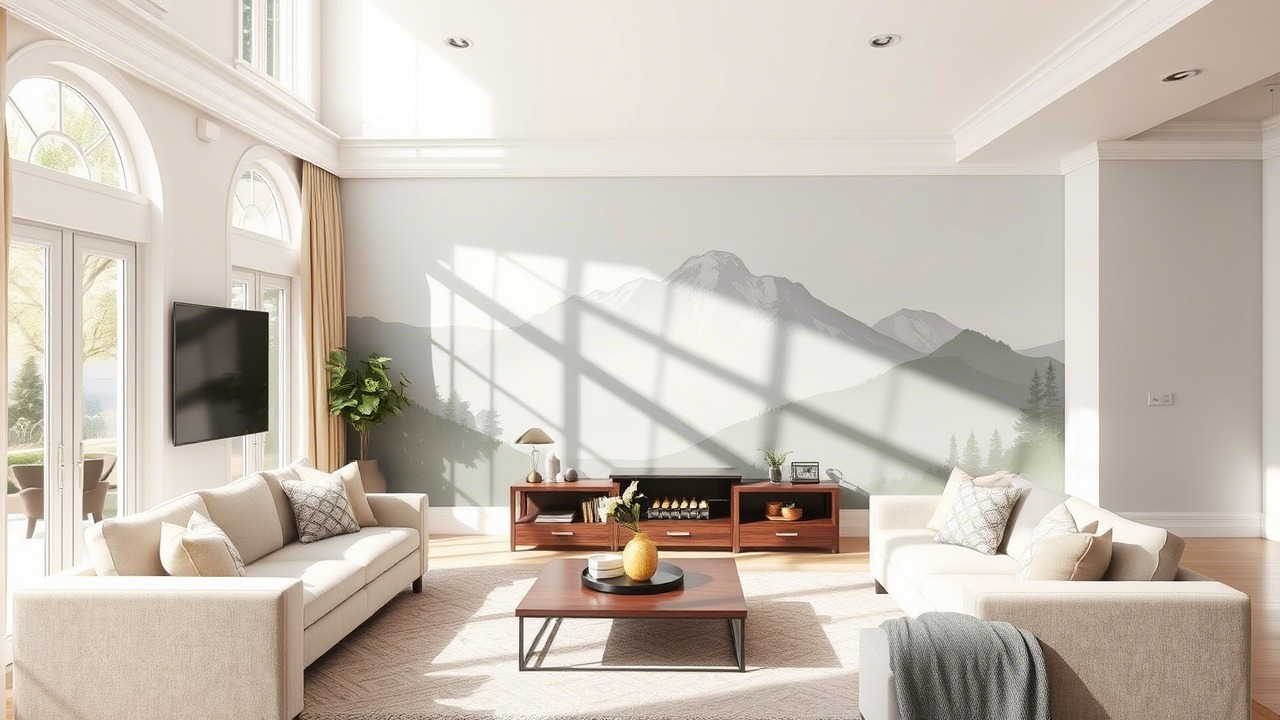
- The Solution: Painting all walls in a single, light, and highly reflective color. Think soft whites, pale creams, ethereal blues, gentle grays, or subtle, airy pastels.
- Why It’s Genius: This is the foundational technique for creating an illusion of space. Light colors act as expansive agents, reflecting both natural and artificial light to make the room feel brighter, larger, and more open. A uniform light color across all walls blurs the room’s corners and edges, making it difficult for the eye to gauge its actual dimensions, thus perceiving it as more spacious.
- Execution is Key:
- Color Choice: Opt for off-whites with cool undertones (like a hint of blue or green) for maximum receding effect, or warm off-whites to maintain a cozy feel while still maximizing brightness. Consider shades like Benjamin Moore’s “Decorator’s White” or Sherwin-Williams’ “Snowbound.”
- Sheen Savvy: A matte or eggshell finish is generally best. Matte finishes diffuse light beautifully and hide minor wall imperfections (common in older or smaller spaces). Eggshell offers a slight sheen for durability and easy cleaning while still providing good light diffusion. Avoid high-gloss on main walls, as it can create distracting glares that break up the space.
- Seamlessness: Paint trim and baseboards in the same color as the walls or a slightly lighter shade (or a crisp white in a subtly higher sheen like satin) to maintain that continuous, expansive feel.
- The Spacious Impact: This is your biggest bang for your buck. The room will instantly feel airier, less visually cluttered, and significantly more open.
2. The “Ceiling Lift”: Reaching for New Heights
- The Solution: Painting your ceiling a color that is lighter than your walls – typically a crisp, pure white.
- Why It’s Genius: Our brains associate lighter tones overhead with openness and height (think of the vast sky). By painting the ceiling white or a shade significantly lighter than the walls, you create a visual “lift.” This makes the ceiling appear higher, which, in turn, makes the entire room feel more voluminous and less boxy. A dark or heavily colored ceiling can have the opposite effect, making the room feel like it’s pressing down on you.
- Execution is Key:
- Classic White Dominance: A flat (matte) bright white is the gold standard for ceilings because it maximizes light reflection and the illusion of height while hiding imperfections.
- The “One Shade Lighter” Principle: If your walls are already a very light color, you can paint the ceiling the same color or a version of it tinted with an additional 10-20% white. This maintains cohesion while still offering that subtle upward lift.
- The Glossy Gamble (For Smooth Ceilings): In a room with a perfectly smooth ceiling, a high-gloss white can act like a reflective surface, almost mirroring the room and creating an incredible sense of depth and height. However, this finish will accentuate any flaws, so proceed with caution.
- The Spacious Impact: This is especially effective in rooms with standard or low ceilings. The perceived increase in vertical space directly translates to a feeling of greater overall roominess.
3. The Monochromatic Harmony: Blurring Visual Boundaries
- The Solution: Utilizing various shades, tints, and tones of a single color family for your walls, trim, and potentially even large furniture pieces or textiles.
- Why It’s Genius: A monochromatic color scheme is a sophisticated space-enhancer. By minimizing stark visual contrasts between different surfaces, you effectively blur the lines where one element ends and another begins. This lack of jarring interruption allows the eye to sweep smoothly across the entire room, creating a sense of continuity and uninterrupted flow that makes the space feel larger, more cohesive, and calmer.
- Execution is Key:
- Choose Your Base Hue: Start with a light to mid-tone color as your foundational hue. This will dictate the overall mood.
- Vary the Shades: Use a slightly lighter shade of your chosen color for the ceiling (as per Solution #2). For trim, you can either use the exact same color as the walls (for the ultimate seamless look), a shade slightly lighter, or even a shade subtly darker for definition that doesn’t break the harmony.
- Texture is Your Friend: To prevent a monochromatic room from feeling flat or uninteresting, incorporate a variety of textures. Think a plush rug, linen curtains, a smooth wooden side table, or a knitted throw – all within your chosen color family.
- The Spacious Impact: This creates a serene, uncluttered, and expansive atmosphere. The visual “quietness” achieved by reducing contrasting elements inherently makes a room feel more spacious and restful.
4. Vertical Stripes: The Height Illusionist
- The Solution: Painting vertical stripes on one or all walls.
- Why It’s Genius: This is a classic optical illusion borrowed from fashion and architecture. Vertical lines inherently draw the human eye upward, making walls appear taller than they truly are. This perceived increase in height adds to the overall sense of volume in the room, making it feel less constricted and more open.
- Execution is Key:
- Subtlety for Small Spaces: In compact rooms, avoid very bold, high-contrast, or numerous narrow stripes, as these can sometimes feel too busy and visually shrink the space horizontally. Instead, opt for:
- Tone-on-Tone Stripes: Use the same color in different sheens (e.g., matte and satin stripes) for a sophisticated, textured, and subtly elongating look.
- Low-Contrast Color Stripes: Choose two closely related light colors, such as a soft white paired with a pale beige, or two shades of a light, cool gray.
- Width Considerations: Wider stripes (around 6-12 inches) generally look more contemporary and less “circus-like” than very thin stripes.
- Accent Wall Strategy: Applying vertical stripes to just one accent wall, perhaps the wall behind the bed or a narrow wall you wish to emphasize, can provide the heightening effect without overwhelming the entire room.
- Precision is Paramount: Use a spirit level, measuring tape, and high-quality painter’s tape (like FrogTape) to achieve crisp, perfectly straight lines.
- Subtlety for Small Spaces: In compact rooms, avoid very bold, high-contrast, or numerous narrow stripes, as these can sometimes feel too busy and visually shrink the space horizontally. Instead, opt for:
- The Spacious Impact: If your room is plagued by low ceilings, this solution can make a dramatic difference in perceived height, making the entire space feel more airy and grand.
5. Horizontal Lines: Expanding Width and Depth
- The Solution: Painting horizontal stripes or bands on the walls.
- Why It’s Genius: Just as vertical stripes add height, horizontal lines draw the eye sideways, making a room appear wider or longer. This can be particularly effective in narrow rooms, long corridors, or any space that feels disproportionately tall and thin, helping to create a more balanced and expansive feel.
- Execution is Key:
- Strategic Placement: This technique often works best on the shortest walls of a rectangular room to visually “push” them outwards, or along the length of a narrow room to enhance its breadth.
- The “Two-Thirds” Technique: A popular and visually effective approach is to paint the lower portion of the wall (often one-third or up to two-thirds from the floor) in one color (perhaps slightly darker or a feature color for grounding) and the upper portion in a lighter color, with a clean horizontal line dividing them. This can also give a nod to traditional wainscoting.
- Wider Bands Preferred: Similar to vertical stripes, broader horizontal bands tend to look more modern and less cluttered in smaller spaces.
- Judicious Application: Applying horizontal stripes to all four walls can sometimes make a room feel shorter or a bit “squashed,” so use this technique thoughtfully, often limiting it to one or two key walls.
- The Spacious Impact: This is fantastic for visually correcting the proportions of narrow rooms, making them feel more balanced and wider, or for making a short room appear to stretch further.
6. The “Color Drenching” Continuity: Seamless and Expansive
- The Solution: Painting the walls, trim (baseboards, window frames, door frames), doors, and sometimes even built-in shelving or radiators all in the exact same color and often the same sheen.
- Why It’s Genius: This sophisticated technique elevates the monochromatic idea by completely erasing the visual interruptions typically caused by contrasting trim and other architectural details. When all these elements blend seamlessly, the boundaries of the room become less defined, fostering an immersive and expansive atmosphere. Your eye isn’t stopped by a white door frame or a dark baseboard; it just flows effortlessly, making the space feel larger.
- Execution is Key:
- Color Choice is Crucial: While this can work with darker, moodier colors in very small, defined spaces to create a cozy “jewel box” effect (see Solution #10), for a general feeling of spaciousness in most small rooms, light to mid-tone neutrals or soft, airy colors are often the best choice.
- Sheen Consistency (or Subtle Variation): Using the exact same sheen (e.g., eggshell or matte) for all elements creates the most seamless and modern look. Alternatively, you can use a slightly higher sheen (like satin) on trim and doors for added durability, as long as the color is absolutely identical.
- Ideal for Complex Layouts: If your room has many awkward angles, soffits, or numerous doors and windows, color drenching can visually simplify the landscape, making it feel less choppy and more unified.
- The Spacious Impact: This is a surprisingly powerful solution. By eliminating those visual “stop signs,” the walls appear to recede further, making the room feel significantly larger, more cohesive, and often more luxurious.
7. The Receding Cool-Tone Accent Wall: Playing with Perspective
- The Solution: Painting one strategic wall (typically the furthest short wall in a rectangular room) a cool, receding color that is slightly darker or more saturated than the other very light surrounding walls.
- Why It’s Genius: While the general rule is “light colors make rooms look bigger,” a single, carefully chosen darker accent wall utilizing a cool color can actually enhance the perception of depth. Cool colors (like blues, greens, and cool-toned grays) naturally recede from the eye. By painting the furthest wall in such a color, you trick the brain into thinking it’s even further away, thereby making the room feel longer or deeper.
- Execution is Key:
- Keep Other Walls Light & Bright: The remaining three walls should be a very light, neutral color (like off-white, pale gray, or a soft cream) to provide strong contrast and maintain overall brightness and airiness.
- Choose a Cool, Muted, or Deep Dark: Avoid warm, advancing dark colors (like deep reds or oranges) for this specific space-enhancing purpose. Think a dusty deep teal, a muted forest green, a sophisticated charcoal gray, or a deep slate blue.
- Strategic Wall Selection: This works best on the shortest wall at the far end of a room. Do not choose a long side wall for this treatment, as this could visually narrow the room.
- Ample Lighting: Ensure this accent wall is well-lit, either naturally or with artificial light, to prevent it from looking like a dark, heavy void and to bring out the richness of the color.
- The Spacious Impact: This can make a boxy room feel more elongated and add a sophisticated focal point without sacrificing the overall sense of airiness provided by the other light-colored walls.
8. The “Disappearing Act” for Bulky Furniture
- The Solution: Painting large pieces of furniture (like tall bookcases, large wardrobes, or bulky dressers) the same color as the walls they are placed against.
- Why It’s Genius: Large, solid furniture can visually dominate and “eat up” a lot of precious space in a small room. By painting these pieces to match the walls, they visually blend in and almost “disappear” into the background. This significantly reduces their visual weight and makes the room feel less cluttered, more streamlined, and consequently, more open.
- Execution is Key:
- Best for “Wallflowers”: This works exceptionally well for built-in shelving or large freestanding items that you don’t necessarily want to be the star attraction but are essential for storage.
- Use Appropriate Furniture Paint: Ensure you use the correct type of paint and primer for furniture (which might be different from wall paint) to ensure good adhesion and a durable, smooth finish.
- Tie-In with Other Solutions: This approach beautifully complements monochromatic (Solution #3) or color-drenching (Solution #6) schemes.
- The Spacious Impact: This clever trick dramatically reduces visual clutter. When your eye isn’t abruptly stopping at a contrasting piece of furniture, the perceived flow and spaciousness of the room are significantly enhanced.
9. Painting Radiators and Pipes to Match the Walls
- The Solution: Painting often unsightly radiators, exposed pipes, or other utilitarian fixtures the same color as the wall they are on or behind.
- Why It’s Genius: These elements, when left in their standard white or metallic finish, can create jarring visual interruptions, breaking up the clean lines of a wall and drawing unnecessary attention. By painting them to match the wall, they visually recede and blend in, creating a more cohesive and uncluttered look, which contributes to a feeling of greater space.
- Execution is Key:
- Proper Paint is Essential: For radiators, use a specialized heat-resistant radiator paint. For other pipes, ensure the surface is clean and appropriately primed if it’s a challenging material like metal or plastic.
- Safety First: Ensure radiators are turned off and completely cool before painting and allow ample drying/curing time before turning them back on.
- Thorough Coverage: Paint all visible sides for a complete “disappearing” effect.
- The Spacious Impact: Similar to painting furniture to match walls, this reduces visual clutter and “noise,” allowing the walls to feel more expansive and the room more serene.
10. The Daring Dark “Jewel Box” Enclosure (For Very Small, Defined Spaces)
- The Solution: In extremely small, enclosed spaces like powder rooms, tiny home offices, walk-in closets, or windowless nooks, embracing the smallness by painting all walls (and often the ceiling too) in a dark, rich, and frequently glossy or satin color.
- Why It’s Genius (The Counterintuitive Approach): This one seems to defy all conventional wisdom for small spaces, but it can be incredibly effective in the right context. In exceptionally tiny or awkwardly shaped rooms where light colors might ironically highlight the cramped dimensions, going dark can blur the corners and edges. This creates a sense of undefined depth and an enveloping, luxurious “jewel box” atmosphere. The walls recede into shadow, making the boundaries less apparent.
- Execution is Key:
- Full Commitment: This isn’t for half-measures. Paint all walls, and seriously consider painting the ceiling the same dark hue (e.g., deep navy, emerald green, charcoal, rich plum, or even black) to enhance the immersive effect.
- Sheen Adds Drama: A satin, semi-gloss, or even high-gloss finish will reflect light within the dark space, adding to the depth, drama, and jewel-like quality. Matte dark colors can feel a bit flat and absorb too much light for this specific expansive illusion, unless you’re aiming for pure cocooning.
- Strategic & Layered Lighting is Non-Negotiable: Ensure excellent artificial lighting – think stylish wall sconces, a statement ceiling fixture, picture lights, or even subtle LED strip lights – to make the glossy dark walls shimmer, to highlight focal points, and to prevent the room from feeling like an actual cave.
- Accessorize with Reflective Elements: Mirrors, metallic accents (gold, silver, brass), and glass or crystal elements will bounce light around and amplify the glamorous, expansive-yet-intimate feel.
- The Spacious Impact (A Different Kind): Instead of making the room feel “bigger” in the traditional airy sense, this technique makes the boundaries of the tiny room almost dissolve, creating a feeling of undefined, luxurious depth and intrigue. It’s about transforming a limitation into a powerful, sophisticated statement.
Beyond the Brush – Additional Considerations for Small Spaces
While these painting solutions are incredibly effective, remember that paint works best as part of a holistic approach to small-space design:
- Declutter Relentlessly: The less stuff you have, the bigger any room will feel. This is non-negotiable.
- Smart Furniture Choices: Opt for appropriately scaled furniture. Leggy pieces that allow you to see the floor underneath create a sense of openness. Multi-functional furniture is also a plus.
- Mirror Magic: Strategically placed mirrors are a small room’s best friend. They reflect light and views, instantly making a room feel larger and brighter.
- Lighting Layers: A well-lit room always feels more spacious. Use a combination of ambient (overall), task (for specific activities), and accent (to highlight features) lighting.
- Maximize Natural Light: Keep window treatments minimal and light-colored (or sheer) to allow as much natural light as possible to flood the space.
Frequently Asked Questions
1. What is the absolute best single paint color to make a very small room look significantly bigger?
While it depends on natural light, a soft, cool off-white or a very pale cool gray is generally considered the most effective. These shades are excellent at reflecting light and making walls visually recede, creating an airy and expansive feel. Pairing this with a crisp white ceiling (Solution #2) amplifies the effect.
2. Will painting a small room entirely white make it look boring or clinical?
Not necessarily! An all-white or very light room can look incredibly chic, serene, and spacious. The key to avoiding a clinical feel is to introduce varied textures (e.g., knitted throws, linen curtains, a plush rug, wooden accents) and perhaps subtle variations in the tone of white for different elements. Good lighting also plays a crucial role.
3. How does the sheen of the paint affect how big a room looks?
Higher sheen finishes (like satin or semi-gloss) reflect more light and can make a space feel brighter. However, they also highlight imperfections on the walls, which can be common in older or smaller homes. Matte or eggshell finishes diffuse light more softly, are better at hiding minor flaws, and contribute to a more seamless, expansive look when used for all-over color (Solution #1). For ceilings, a flat white is usually best.
4. My small room has very little natural light. What are the best painting solutions?
Focus on maximizing any available light. The “Light & Luminous” All-Over Embrace (Solution #1) using a highly reflective off-white or pale pastel is crucial. The “Ceiling Lift” (Solution #2) with bright white is essential. Consider the High Gloss Ceiling technique if your ceiling is perfectly smooth. Strategic use of mirrors in conjunction with these paint choices will also be very beneficial. Avoid dark colors unless you are attempting the very specific “Jewel Box” effect in a tiny, defined space (Solution #10), which relies heavily on artificial light.
5. Can I use dark colors in a small room if I want it to feel more spacious?
Generally, light colors are recommended for creating an airy sense of space. However, two exceptions are: the Receding Cool-Tone Accent Wall (Solution #7), which uses a darker cool tone on one far wall to create depth, and the Daring Dark “Jewel Box” (Solution #10) for very tiny, enclosed spaces where dark, often glossy, colors can blur boundaries and create a sense of infinite depth.
6. Are stripes (vertical or horizontal) always a good idea for every type of small room?
Stripes can be very effective but should be used thoughtfully and with subtlety in small spaces. Vertical stripes (Solution #4) are best for rooms with low ceilings you wish to make appear taller. Horizontal stripes (Solution #5) work well in narrow rooms you want to feel wider. In very small or already visually busy rooms, overly bold or numerous stripes can feel overwhelming and counterproductive. Opt for subtle, low-contrast, or tone-on-tone stripes.
7. How do I choose between using vertical or horizontal stripes to make my room look bigger?
If your primary concern is making a low ceiling appear higher, choose vertical stripes. If your room feels too narrow or disproportionately short in length/width, choose horizontal stripes to visually widen or lengthen it.
8. Will painting my trim, doors, and walls all the same color really make a difference in a small room?
Yes, this is a key principle behind the Monochromatic Harmony (Solution #3) and especially the “Color Drenching” Continuity (Solution #6). When the trim and doors blend seamlessly with the walls, it eliminates visual breaks and interruptions. This allows the eye to flow smoothly across the surfaces, making the walls appear to recede further and the room to feel significantly larger and more cohesive.
9. My small room has some awkward architectural angles or features. What’s the best painting strategy to minimize them?
The “Color Drenching” Continuity (Solution #6) is excellent for rooms with awkward angles, soffits, or lots of visual interruptions. By painting everything (walls, trim, quirky bits) the same color, you simplify the visual landscape, making those features less noticeable and the space feel more unified and therefore larger. Alternatively, painting radiators or pipes to match the wall (Solution #9) also helps these elements “disappear.”
Conclusion – Your Expansive Oasis Awaits – No Demolition Required!
Who knew that a few cans of paint, combined with some clever insights into visual perception, could wield such transformative power? These 10 genius wall painting solutions prove that you don’t need a massive budget or a construction crew to create a home that feels open, airy, and wonderfully spacious. By understanding how to manipulate light, color, and line, you can become the master of illusion, turning your compact living areas into havens that feel far grander than their actual square footage might suggest.
So, take a fresh look at your small rooms, choose the solutions that resonate with your style and your space’s needs, grab your brushes, and prepare to witness an almost unbelievable transformation. Your journey to a bigger-feeling, more beautiful home starts with a single, strategic stroke of genius – and a thoughtfully chosen can of paint!
Leave a Reply